Indoman Tours
A refined luxury travel identity built around privacy, warmth, editorial imagery, and a quiet atelier feel. The system balances Indian heritage cues with contemporary restraint for high-value private travel.
Black, white, and color versions
The logo combines a circular travel seal, a gold sun, a horizon/route line, and a refined wordmark. It should feel crafted, calm, and premium rather than loud or commercial.
Primary use on cream, ivory, and pale editorial backgrounds.
Best over dark imagery, hero overlays, mobile menu, and footer areas.
Use for invoices, stamps, single-color printing, and formal documents.
Website header and mobile
The current header is transparent over hero photography, then becomes a soft cream bar on scroll. Mobile keeps the logo compact and moves navigation into a full-screen dark menu.

Handcrafted luxury journeys through India and beyond - private, personal, and quietly extraordinary.
Editorial, calm, personal.
Masonry destination tiles.
Inquiry-first conversion.

Mobile keeps the brand elegant with large imagery, strong spacing, and a focused menu.
Design concept and mockup flow
The home page is structured like a private travel editorial. It opens with a cinematic split hero, then moves into trust, collection browsing, signature experiences, testimonials, and lead capture.
Large destination image paired with an intimate editorial headline and two clear calls to action.
A confident positioning block: private travel atelier, not booking platform.
Horizontal storytelling panels for India and beyond-border journeys.
Image-led destination browsing with organic corners and masonry rhythm.
High-contrast experience storytelling to create depth and premium drama.
Concierge-first enquiry form with WhatsApp as the immediate conversation path.
Proposed palette
The palette is warm, subdued, and travel-editorial. Creams and dark espresso create restraint, while gold, amber, forest, and clay bring Indian luxury and landscape warmth.
#F5F0E8
#E8DFD0
#1C1917
#B8860B
#D4A04A
#2D4A3E
Type direction
The typography pairs a high-end serif with clean modern sans faces. The result feels literary, precise, and quietly luxurious.
Noto Serif Display for hero headlines, large statements, and emotional storytelling.
Plus Jakarta Sans for body copy, forms, descriptions, and interface clarity.
Space Grotesk for nav links, eyebrow labels, small headings, and numbered details.
Sample imagery and visual direction
Images should feel curated, sensory, and specific: real places, beautiful light, texture, privacy, and moments that look experienced rather than staged.

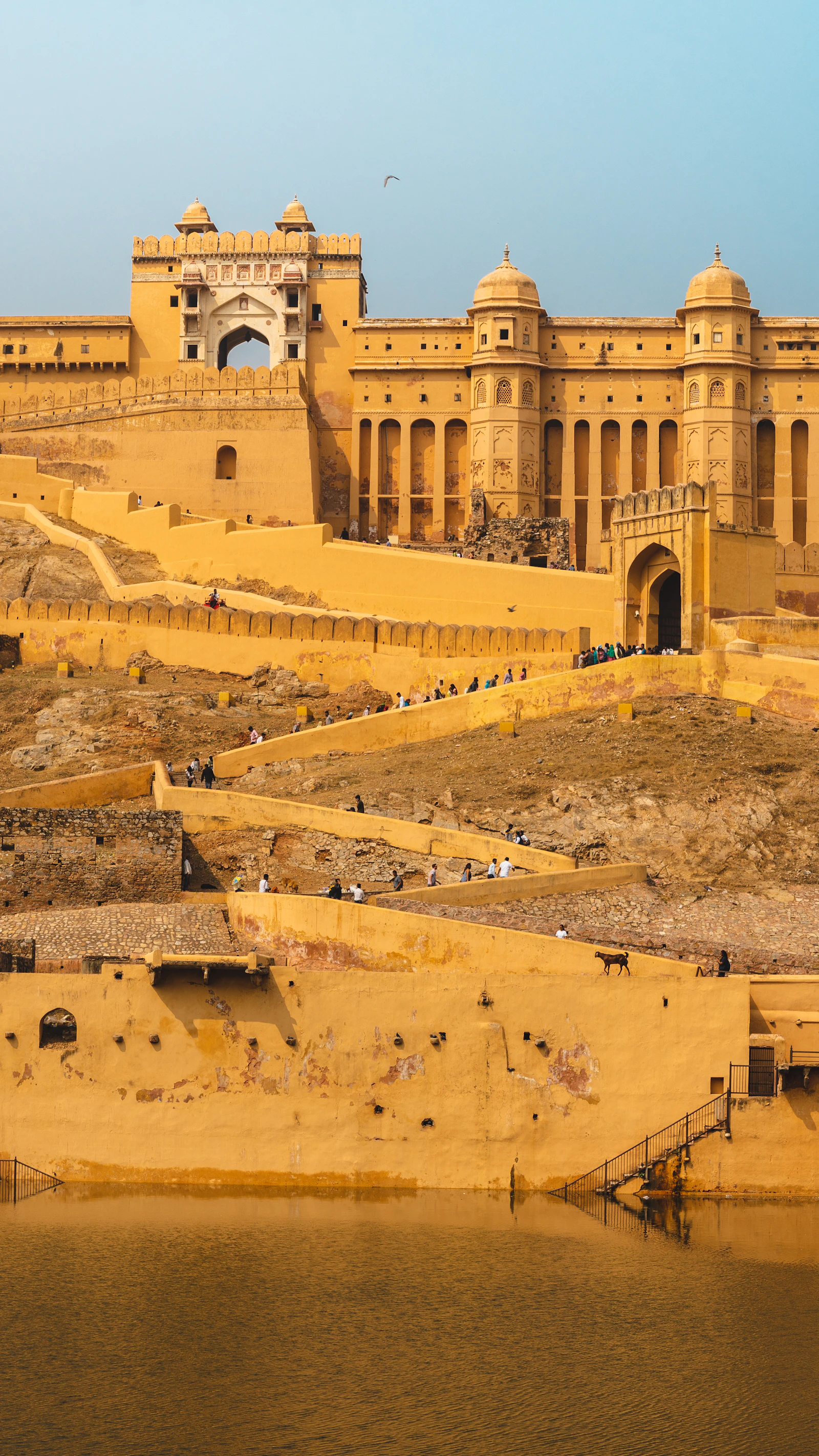
Palaces, forts, arches, and warm late-afternoon light.

Water, boats, courtyards, retreats, and slow luxury.

Markets, craft, food, ceremonies, hands, textiles, and detail.
Islands, wellness, desert resorts, and refined escapes beyond India.
Quietly opulent, editorial, sensory, and personal. The site should feel like a private recommendation from a seasoned travel designer.
Large cinematic crops, generous whitespace, slow reveal animations, organic image corners, and restrained interface chrome.
Generic stock smiles, over-saturated filters, heavy gradients, crowded layouts, cheap travel agency tropes, and loud discount-led design.
Recommended visual rules
These rules keep the brand consistent across website, proposals, social posts, and printed collateral.